Table of Contents
ToggleChoosing the right paint color for a home office isn’t about matching throw pillows or following trends, it’s about creating an environment that supports focus, reduces fatigue, and keeps motivation steady through long workdays. The wrong color can drain energy or create visual stress, while a well-chosen palette can genuinely improve concentration and output. This guide breaks down which colors deliver real productivity benefits, how to apply them strategically, and what to avoid when painting a workspace. Whether renovating a dedicated office or carving out a corner in a spare room, understanding color psychology and practical application makes all the difference.
Key Takeaways
- Office paint colors directly influence focus, energy levels, and stress through color psychology—blue, green, and warm neutrals are top productivity boosters, while bright red, neon, and cool grays should be avoided.
- Cool-toned blues and greens lower heart rate and promote sustained concentration, making them ideal for analytical work, while warm neutrals like greige offer professional versatility for home office interior design.
- Always test paint samples under different lighting conditions and times of day, as natural north-facing light and LED color temperatures dramatically affect how colors perform in your workspace.
- Accent walls on walls behind or opposite your desk add visual interest without overwhelming the space, and can be applied with just one gallon of paint while avoiding eye strain from dark tones behind monitors.
- Paint finish matters—use flat or matte finishes to reduce glare on screens, eggshell or satin for durability and easy cleaning, and prioritize low-VOC or zero-VOC formulas to minimize off-gassing in enclosed home offices.
- Pair blue or green office paint colors with warm wood tones, task lighting set to 2700-3000K, and avoid sterile effects by incorporating warm textiles and ensuring proper lighting to balance cooler wall hues.
How Color Psychology Affects Your Work Performance
Color psychology isn’t pseudoscience, research consistently shows that different wavelengths of light affect brain activity, heart rate, and even cortisol levels. The visual cortex processes color before conscious thought kicks in, meaning the walls influence mood and alertness before anyone realizes it.
Cool colors (blues, greens) generally lower heart rate and promote calm, making them ideal for analytical work or tasks requiring sustained attention. Warm colors (reds, oranges) increase arousal and can boost energy, but they also elevate stress markers when overused. Neutral tones (grays, beiges, warm whites) provide a baseline that doesn’t compete for attention, which can be helpful in visually busy spaces or when working with multiple monitors.
Lighting conditions matter as much as the paint itself. A color that looks energizing under natural north-facing light might feel drab under LED bulbs with a cool color temperature. Always test samples on at least two walls, one that gets direct light and one in shadow, and observe them at different times of day. Paint finishes also impact perception: flat or matte finishes reduce glare (important for screen-heavy work), while eggshell or satin finishes are easier to clean and better for high-traffic home offices.
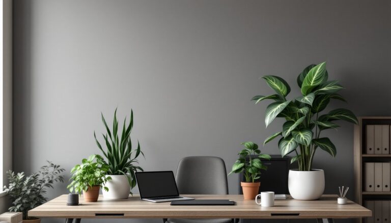
The size and purpose of the space also guide color choices. A small, windowless office benefits from lighter tones that reflect available light, while a large room with ample natural light can handle deeper, more saturated colors without feeling oppressive. Consider the type of work being done, creative tasks may benefit from warmer, stimulating tones, while detail-oriented or analytical work often pairs better with cooler, calming hues.
Best Paint Colors to Boost Productivity in Your Home Office
Blue Tones: The Focus and Concentration Champion
Blue consistently ranks as the top productivity color in workplace studies, and for good reason. It lowers blood pressure, slows respiration, and creates a mental environment conducive to deep work. Not all blues are equal, though.
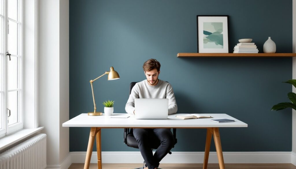
Mid-tone blues (think slate, denim, or powder blue) strike the best balance, light enough to keep a room feeling open but saturated enough to provide visual interest. Avoid overly bright or primary blues, which can feel childish or cold in a professional setting. Navy or deep indigo work well as accent walls but can make a room feel smaller if used on all four walls.
For application, use a satin or eggshell finish for easy cleaning. Blues pair well with warm wood tones (oak, walnut) and brass or gold hardware, which counteract any coolness. If the office doubles as a guest room or multipurpose space, blue remains neutral enough not to clash with other functions.
One caution: blue can feel sterile or uninviting in rooms with minimal natural light or cold-temperature LED bulbs. Warm up the space with task lighting (2700-3000K bulbs) and warm-toned textiles.
Green Shades: Balance and Reduced Eye Strain
Green is the most restful color for the human eye, it sits in the center of the visible spectrum and requires the least adjustment from the optic nerve. This makes it ideal for offices where screen time dominates or for anyone prone to eye fatigue.
Sage, olive, and soft mint are particularly effective. They provide enough color to feel intentional without overwhelming the senses. Deeper greens like forest or hunter green work well as accent walls, especially behind a desk or bookshelf, but use them sparingly, too much dark green can feel heavy or dated.
Green pairs naturally with natural materials: linen, jute, unfinished wood, and stone. It’s also forgiving with decor, both warm and cool accent colors work. For a home office that connects to outdoor views, green creates visual continuity and reduces the contrast between indoor and outdoor spaces.
When choosing green, avoid anything with too much yellow (which can veer into chartreuse and feel jarring) or too much gray (which can look muddy in low light). Test multiple shades: green reads differently depending on the room’s orientation and existing light.
Warm Neutrals: Professional Yet Energizing
Warm neutrals, soft taupes, greiges (gray-beige hybrids), and warm whites with cream or yellow undertones, offer versatility and timelessness. They create a clean backdrop without the starkness of pure white or the dullness of cool gray.
Greige has become a go-to for good reason: it balances the professionalism of gray with the warmth of beige, making it suitable for video calls and client-facing work. Look for shades with an LRV (Light Reflectance Value) between 50-65 for a balanced feel, not too dark, not blindingly bright.
Warm whites (not pure white or cool whites with blue undertones) work especially well in small offices or spaces with limited natural light. They reflect light efficiently and make rooms feel larger. For home office interior design inspiration, these neutrals provide a professional backdrop that doesn’t compete with furnishings or tech equipment.
Soft taupe with pink or brown undertones adds subtle warmth without reading as overtly “colorful.” It’s particularly effective in home offices that need to maintain a residential feel or transition smoothly into adjacent living spaces.
When working with neutrals, the trim color becomes critical. Bright white trim creates crisp contrast, while off-white or cream trim softens transitions. Use a flat finish on ceilings to minimize glare and eggshell or satin on walls for durability.
Colors to Avoid in Productivity-Focused Workspaces
Bright red and orange might energize in small doses, but entire rooms painted in these hues increase stress hormones and can trigger anxiety, especially during high-pressure work. If warm tones are desired, use them as accents, a single wall, a painted door, or trim, not as the dominant color.
Pure white or stark white may seem like a safe choice, but it often creates glare (especially with multiple light sources or windows) and can feel clinical or sterile. It also shows every smudge and requires frequent touch-ups. If white is non-negotiable, choose warm whites or off-whites with subtle undertones.
Dark browns and heavy earth tones can feel grounding in living rooms, but in offices they tend to absorb light and create a cave-like effect. This is especially true in basements or rooms with only one window. If brown tones are desired, stick to lighter tans or pair them with ample task and ambient lighting.
Bright or neon colors (hot pink, lime green, electric blue) are distracting and visually fatiguing over time. The eye constantly adjusts to high-saturation colors, which can lead to headaches or difficulty focusing. Reserve these for small accent pieces, not wall coverage.
Cool grays without warm undertones became trendy in the 2010s but often read as cold, institutional, or depressing in home offices, especially in northern climates or rooms with limited sunlight. Recent home office trends favor warmer, more inviting palettes that balance professionalism with comfort. If gray is the goal, choose greige or gray with beige/taupe undertones to avoid the cold, flat feel.
Accent Wall Strategies and Two-Tone Combinations
An accent wall adds visual interest without overwhelming the space. The key is choosing the right wall and pairing colors thoughtfully.
Which wall to accent: Typically, the wall behind the desk or the wall facing the desk works best. Avoid painting the wall with the door or windows as the accent, these already have visual breaks (trim, frames) that compete for attention. In a small office, the back wall (farthest from the door) creates depth without closing in the space.
Successful two-tone combinations:
• Soft sage (main walls) + deep forest green (accent) – adds richness without clashing
• Warm greige (main) + slate blue (accent) – professional yet calming
• Cream (main) + warm terracotta (accent) – energizing but not overwhelming
• Light gray-blue (main) + charcoal (accent) – modern and focused
Application tips: Use painter’s tape rated for delicate surfaces (especially over fresh paint on adjacent walls) and remove it while the paint is still slightly tacky to avoid peeling. A quality 2.5-inch angled brush handles cut-in work at corners and trim more precisely than rollers.
For a subtler effect, use the same color family but vary the saturation, for example, a light blue on three walls and a deeper blue on one. This creates visual interest without sharp contrast.
Accent walls also offer an opportunity to test bolder colors with lower commitment. Incorporating workspace enhancements like strategic color blocking can improve focus and morale without a full room repaint. A single gallon of paint covers approximately 350-400 square feet with one coat (less on textured or unpainted drywall), so an 8×10-foot accent wall typically requires less than one gallon.
Hardware and trim considerations: If adding an accent wall, keep trim and molding consistent across the room, switching trim colors mid-room rarely looks intentional. Warm-toned accent walls pair well with oil-rubbed bronze or matte black hardware, while cool-toned accents suit brushed nickel or chrome.
Safety and prep notes: Always prime new drywall or patched areas before painting. Use a low-VOC or zero-VOC paint to minimize off-gassing, especially in enclosed home offices with limited ventilation. Wear a dust mask when sanding and ensure proper airflow during and after painting. Allow at least 24 hours of drying time before moving furniture back, and longer in humid climates.
Finally, consider how the accent wall interacts with office productivity tools and equipment. Avoid placing dark accent walls directly behind monitors, which can increase eye strain due to high contrast. Instead, position darker tones on perpendicular or opposite walls to maintain balanced lighting around screens.